Color in Interior Design
Stay Informed
Color is one of the most powerful tools in an interior designer’s palette. It shapes the mood, enhances spatial perception, and brings cohesion to a room. A strategic update to a color scheme can effortlessly breathe new life into a space, even when a few original elements are retained.
Working with color is a joy. Beyond aesthetics, it’s a sensory experience that engages both designer and client. A refined color scheme starts with a solid understanding of color theory—rooted in the science of light, but elevated through creative intuition.
Psychological Impact of Color
Color deeply affects how we experience space. Warm hues evoke comfort and intimacy, perfect for relaxed, welcoming environments. Cool tones, by contrast, convey sophistication and serenity. Many attempts have been made to identify the impact of the various color hues, but it cannot be determined whether these reactions are innate or cultural. For example, death and mourning are associated with the color black in Western traditions, whereas in China and other oriental civilizations, the color of death is white. Designers must consider cultural nuances and context: while red might signal energy and urgency, it can also symbolize joy or danger depending on use and tradition.
Color Harmony and Schemes
As in music, certain color combinations resonate beautifully, while others clash. A well-composed palette balances harmony with contrast, creating spaces that feel both intentional and engaging. Below are key color scheme strategies used in interior design:
Monotone (Neutral)
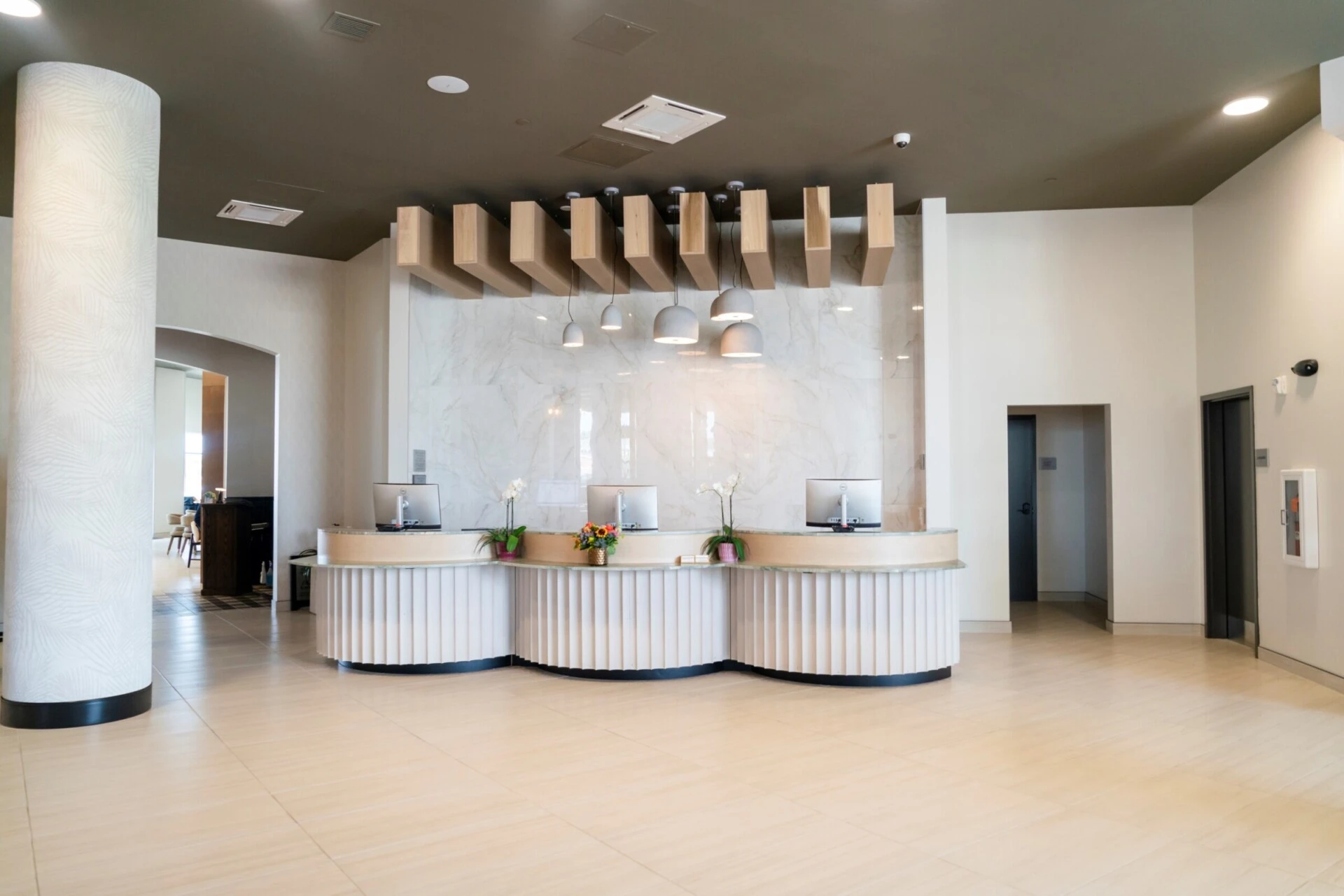
Utilizes a single neutral hue—such as grey, taupe, or ivory—with minimal variation in value. Effortlessly elegant, this approach is ideal where the architecture, views, or artwork provide natural focal points. To avoid visual fatigue, designers often incorporate bold accents or layered textures.

Analogous
Combines colors adjacent on the color wheel, such as blue, blue-green, and green. These palettes are naturally harmonious and well-suited for serene, layered interiors. Their subtle contrast allows for complexity without chaos.

Complementary
Pairs hues opposite on the color wheel, like orange and blue or violet and yellow. High in contrast and energy, complementary schemes are bold and dynamic. Best used with restraint and balance to avoid visual overstimulation.

Triadic
Features three evenly spaced hues, such as red, yellow, and blue. Visually striking yet challenging to master, triadic palettes often benefit from muted tones and a dominant base color to ground the composition.

Tetradic
Employs four equidistant hues on the color wheel. Rare and complex, these schemes demand precision but reward with richness and variety. A skilled hand is essential to maintain balance and prevent discord.

Whether bold or subtle, color has the power to transform. In interior design, it’s more than a surface-level choice—it’s a storytelling tool that shapes how we feel and interact within a space. By understanding the principles of color and applying them with intention, designers can craft interiors that are both beautiful and meaningful.

Let’s Connect.
See the Fisher Difference for Yourself.
At Fisher Architecture, we design with intent, and we build with our clients in mind. Our work spans residential, commercial, mixed-use, hospitality, medical, and government sectors across the East Coast, with over 1,700 projects completed and counting.